Case Study - THORSBRENNER
During my studies in Design & Business we had to opportunity to work with case companies and put to use our knowledge of brand management and brand identity.
Thorsbrenner, a lifestyle baby and parent brand who's main product is a multi-functional diaper bag, had been struggling to reach their target market and grow the company. We were tasked with creating a new brand strategy and redefining the visual and verbal identity.
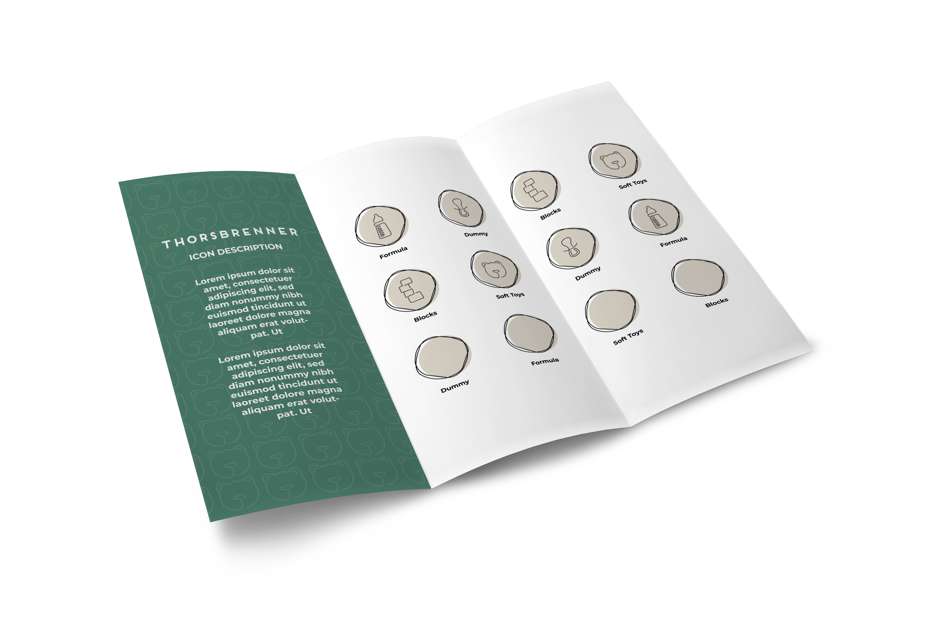
BAG ICONS
After interviewing the target audience we found that they thought the current design was too functional and not very aesthetic. We also identified them as down-to-earth parents who desired to go on adventures and explore the world with their kids, especially in nature. The design for the icons incorporated these insights, keeping the colours earthy and finding a balance between function and beautiful design.
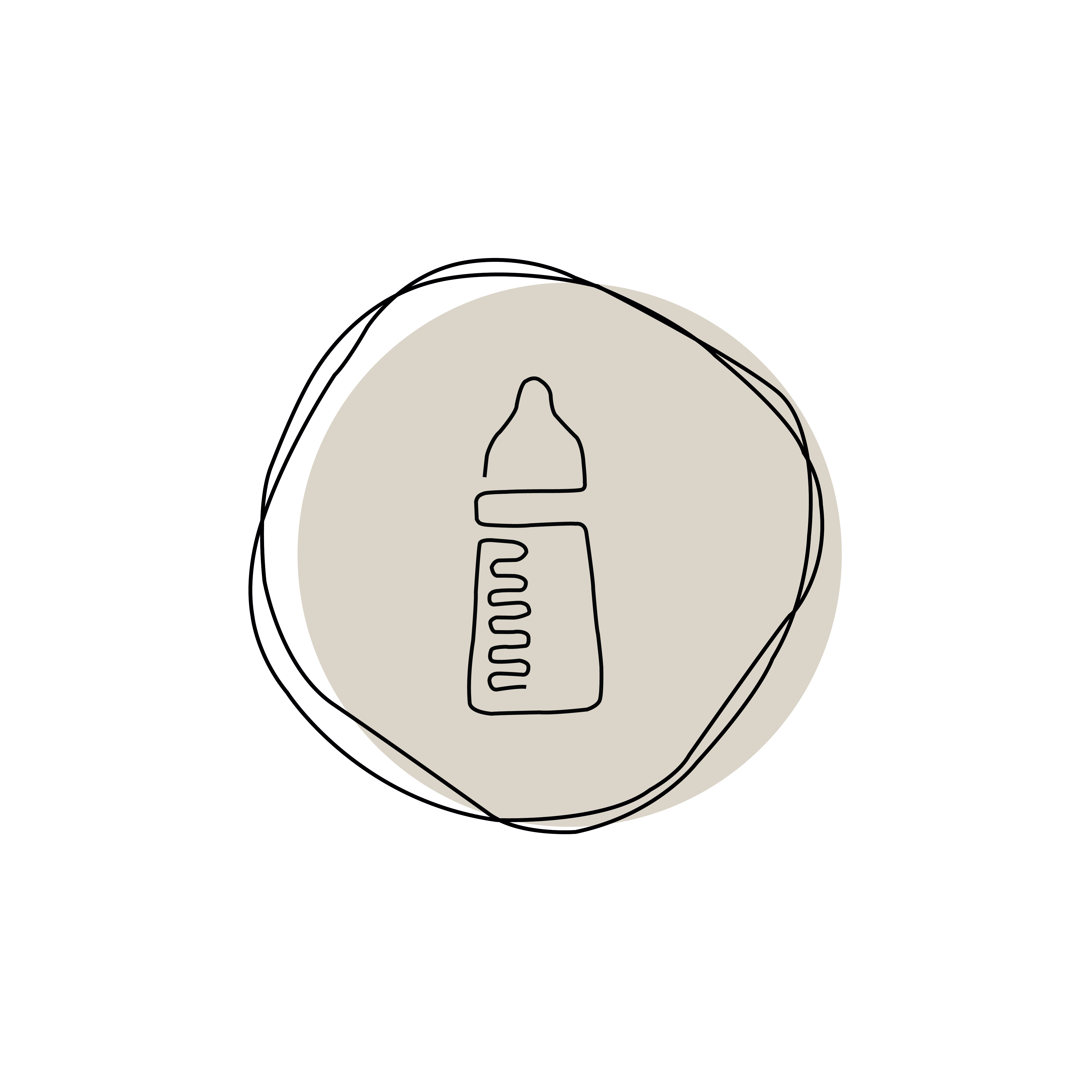
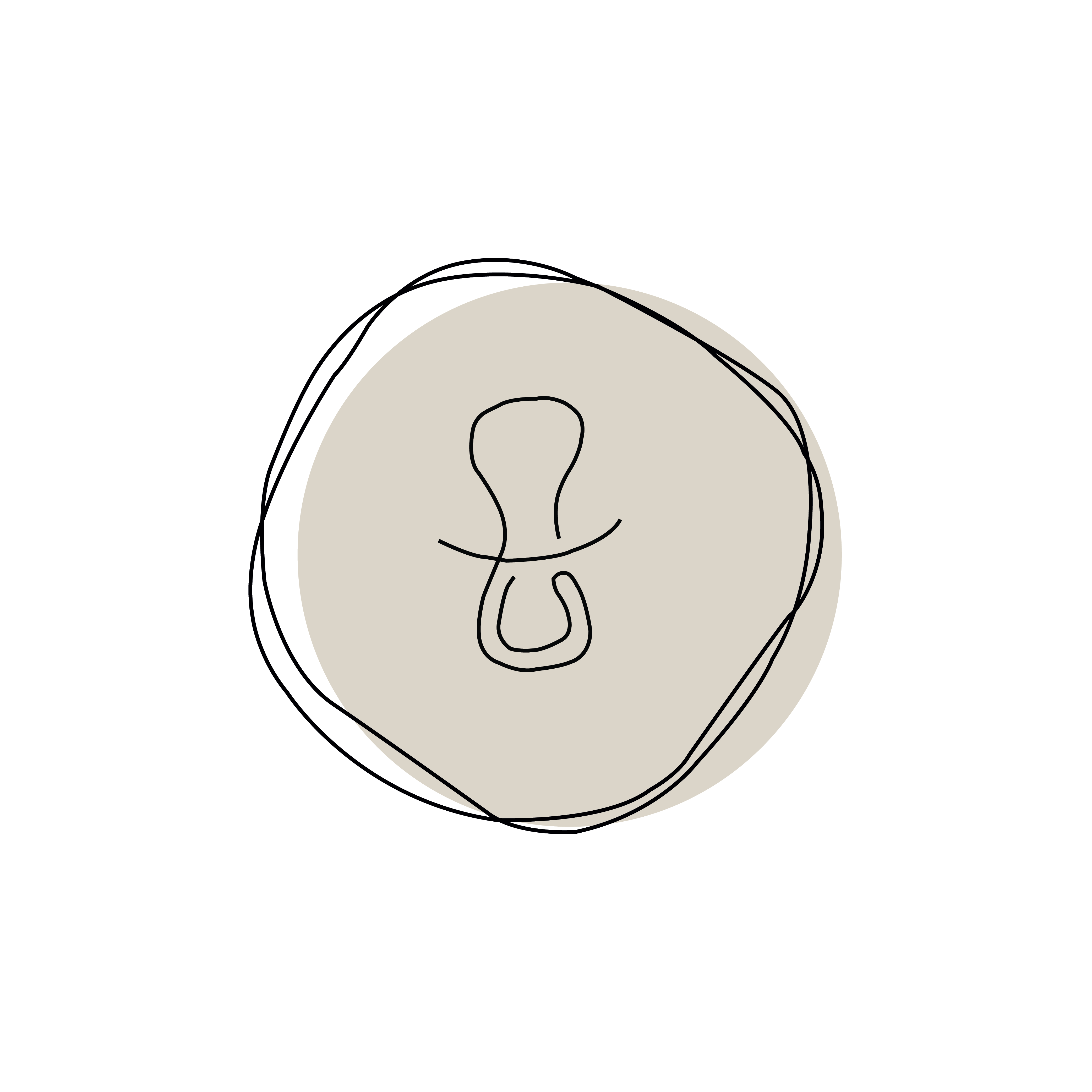
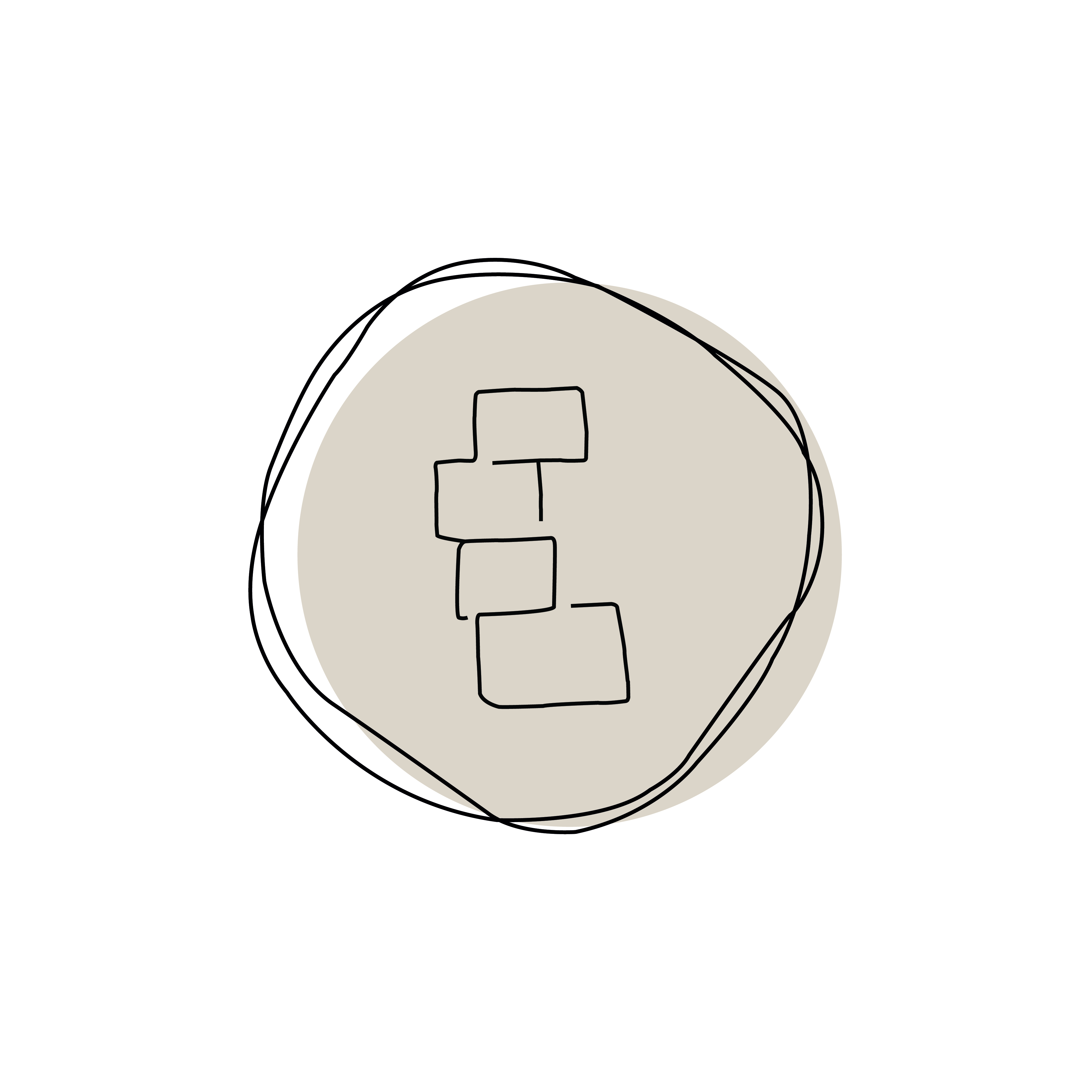
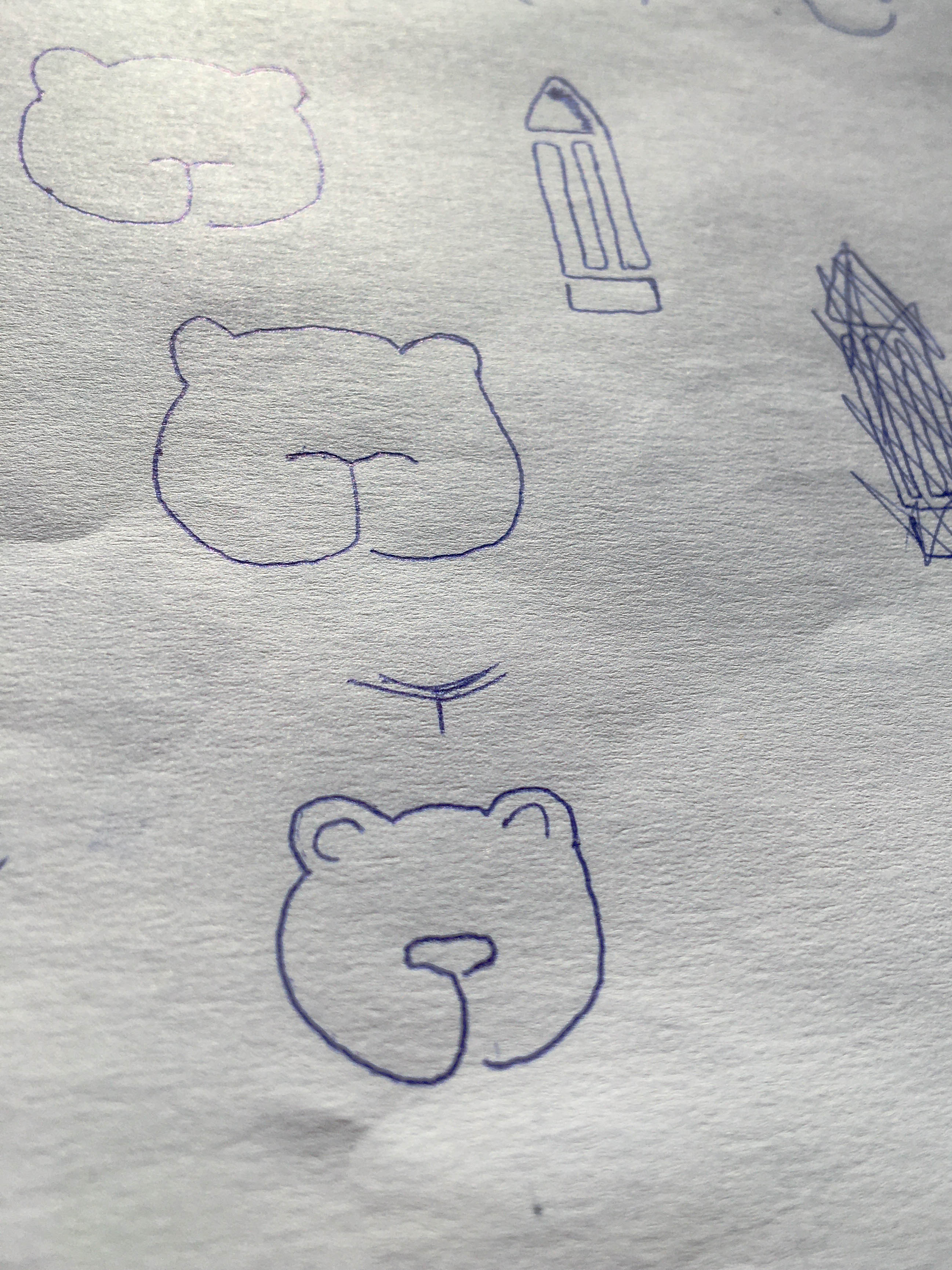
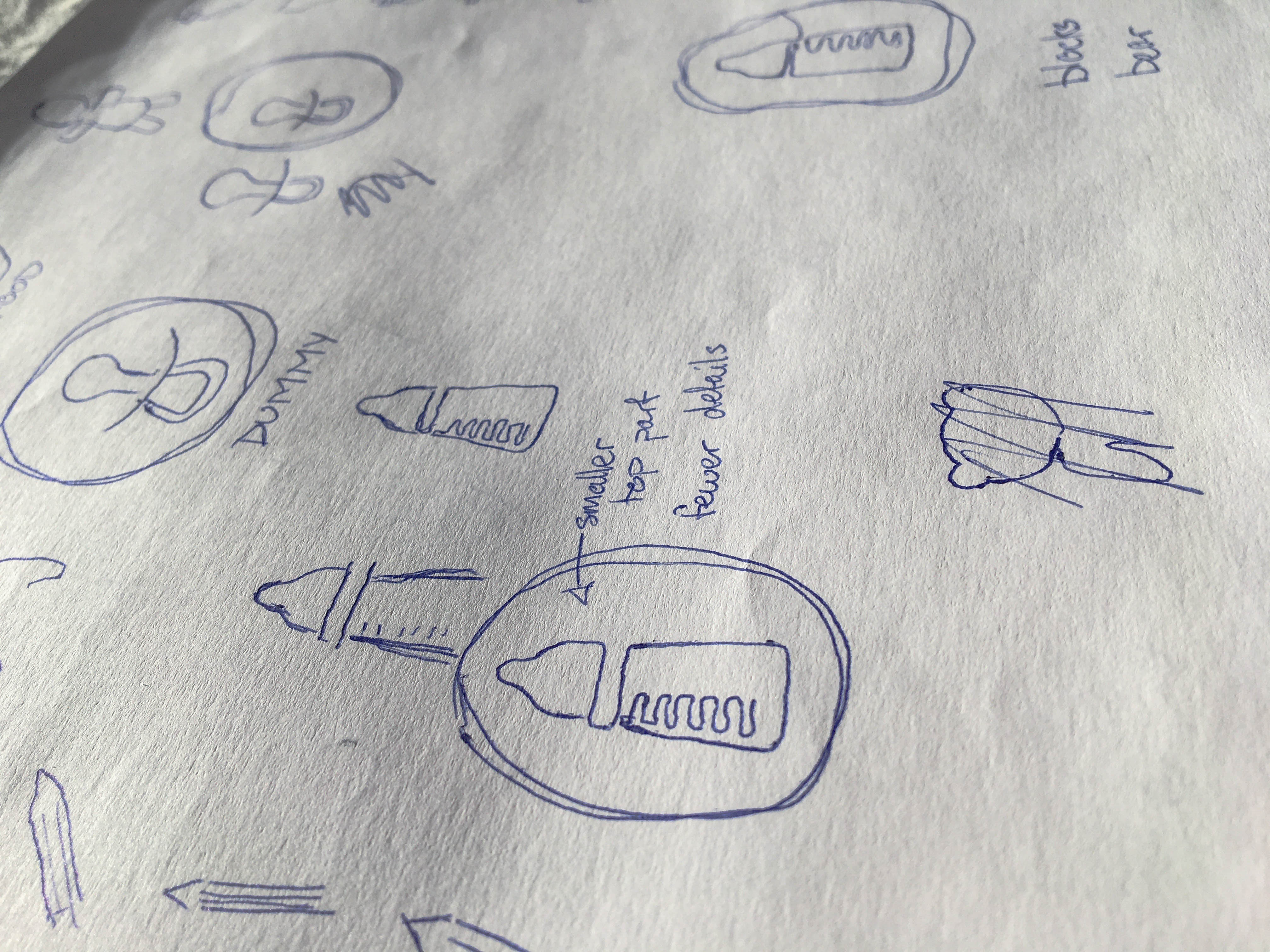
Rebranding the visual identity involved tweaking the pre-existing design elements to align with the new identity. I redesigned icons Thorsbrenner incorporated in her diaper bag, which were used to help parents find the items they were looking for. They follow the same style of the new logo my group designed and were created with the insights of the target audience in mind.